
Ruđer Bošković Airport
Dubrovnik Airport has changed its name to Ruđer Bošković Airport. For this reason, Filburg’s team has been entrusted with designing a new visual identity which will reflect the new direction.
CLIENT
Dubrovnik Airport Ltd.
ASSOCIATES
Nenad Vukušić (coywriting)
In case of Dubrovnik, 70% of guests arrive by plane so the airport is the first encounter with the destination. Target audienced span across business segment to airport visitors of which there are many types, from domestic and foreign passengers of different typologies to people welcoming the passegners but not travelling themselves.
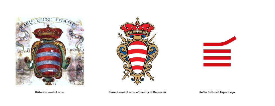
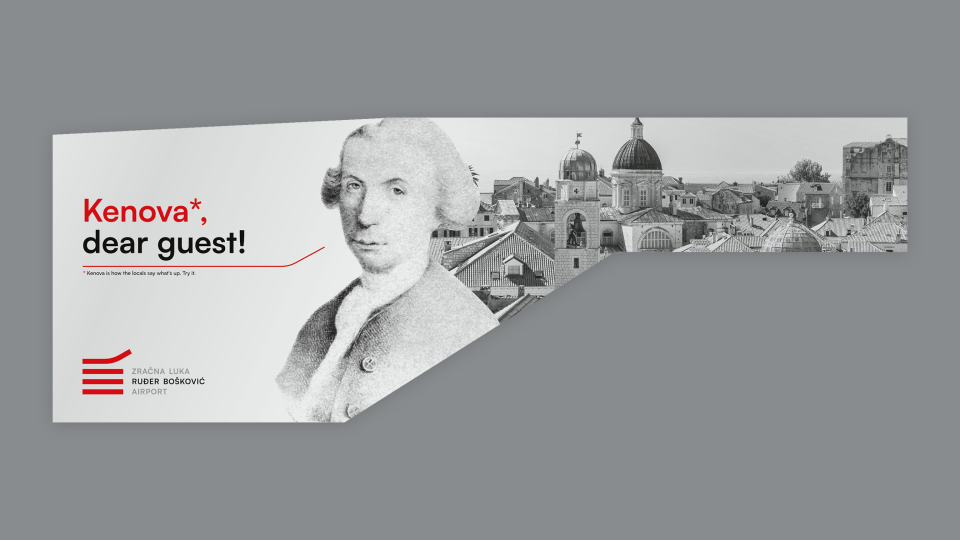
Although there doesn’t exist an official branding and communication strategy of the destination, there is a certain tendency of major Dubrovnik DMCs in using recognisable forms and colours. An additional requirement in this project was a visual and verbal integration of Ruđer Bošković, the great scientist and philosopher from the 18th century, born in Dubrovnik.
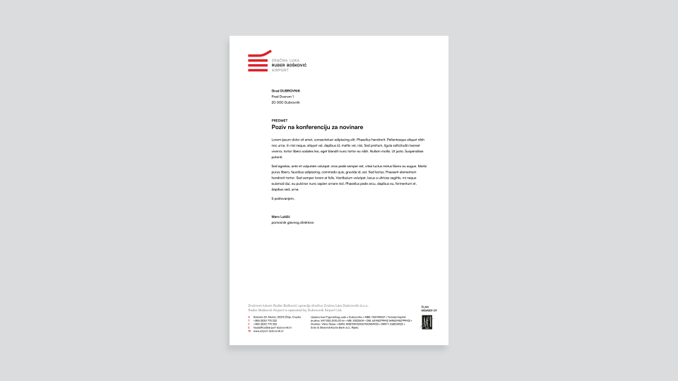
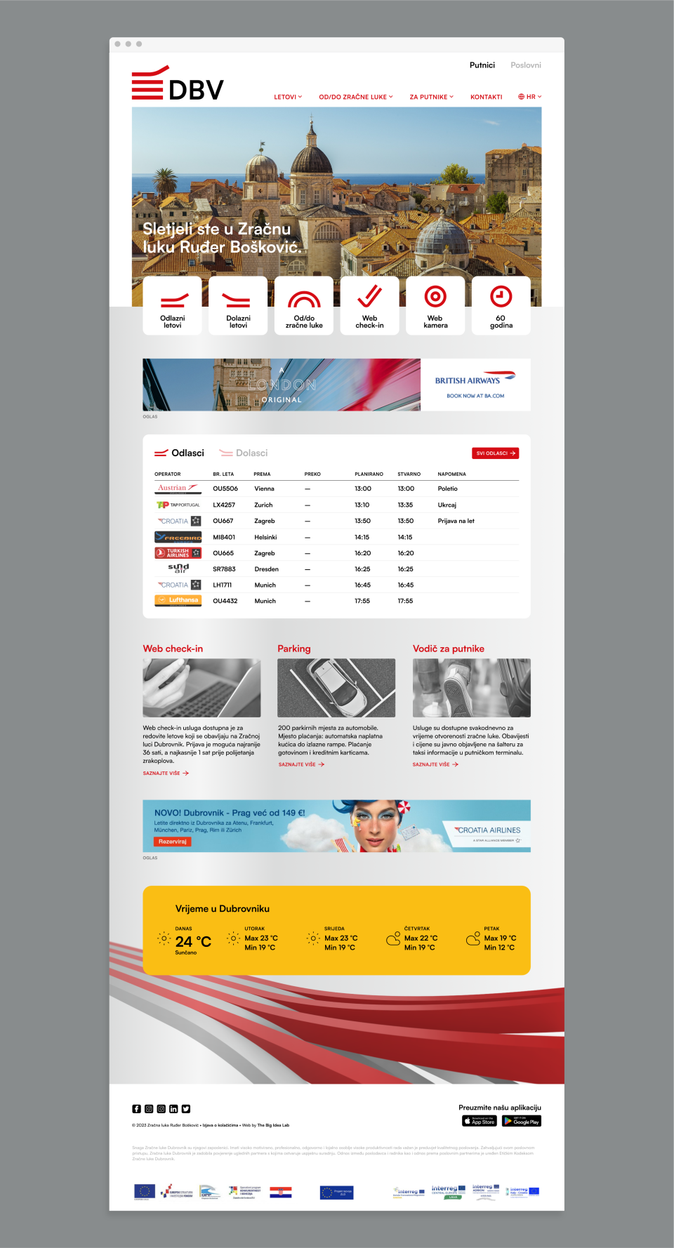
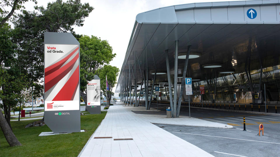
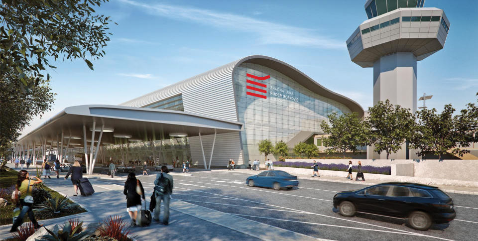
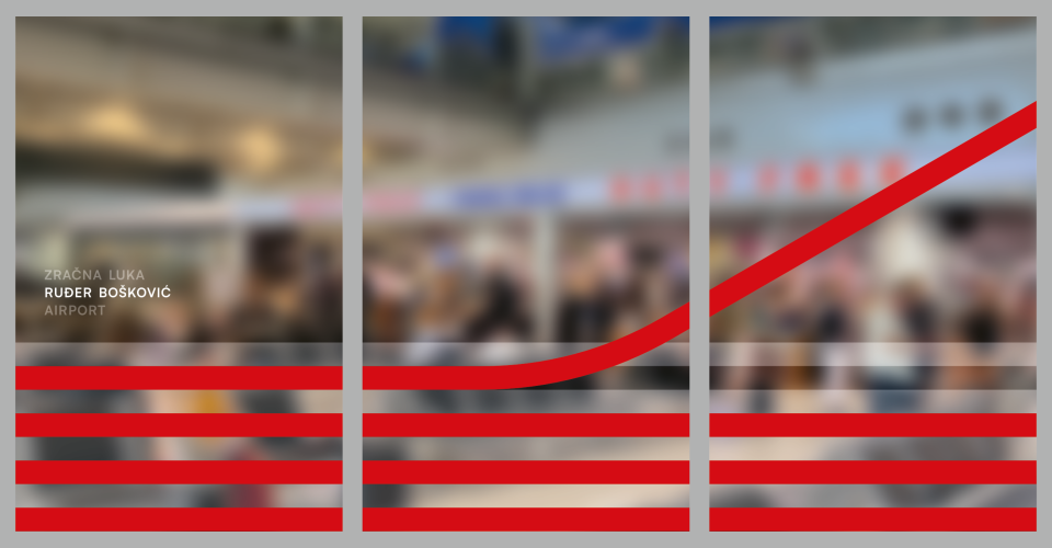
The concept, around whose implementation a complex network of stakeholder agreed, is based on colour and forms derived from Dubrovnik’s historical coat of arms, creating a connection between the airport, the destination, and its heritage. Apart from that, the main logo visually suggests airport runways as well as the moment in which an airplane takes off, gaining a clear meaning and carrying an interesting dynamics in spite of very simple constructive elements.
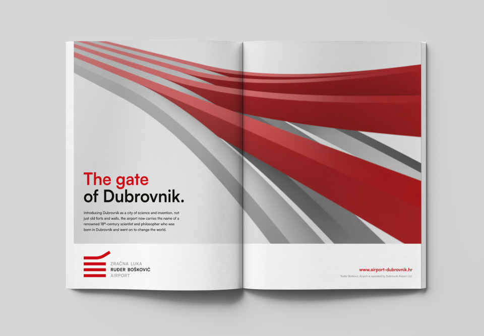
Considering a long and relatively complex name with lots of diacritics, the typography of the logo is understated and simple, while multilingual versions have been unified in one form to make it more easily applicable and more recognisable. In applications of the identity, basic motifs from the logo are transformed into spatial, animated drawings within clean compositions, to communicate vibrancy at the same time as an elegance of the destination itself.
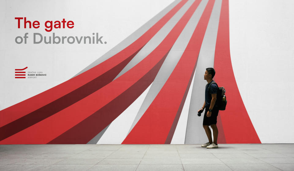
To keep a certain continuity and clarity of communication, the new main slogan — The gate of Dubrovnik — explicitly defines its location and evokes rich experiences awaiting the travellers there.
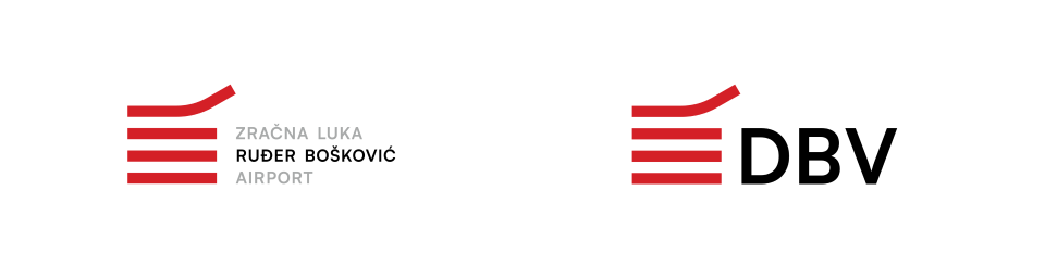
One of specifics in airport communications is its aviation acronym, in this case DBV. Airports in Los Angeles, Sydney, Vienna, as well as Zagreb, emphasise these acronyms both in internal and external visual communications. In the identity system we designed the airport acronym can be used where it’s functionally useful, for example on the airport web site.
- Art direction
- Visual identity
- Graphic design
- Slogan and copywriting
Related projects
Lazareti
Visual identity

for a better City
Name, slogan and visual identity

ZIC Split
Visual identity and communications