
University of Split
“A young and progressive university, innovative and dynamic, sustainable, oriented towards the Mediterranean but modern and in a historical town” — this is how the management of the University of Split positioned the institution to differentiate within the European context.
CLIENT
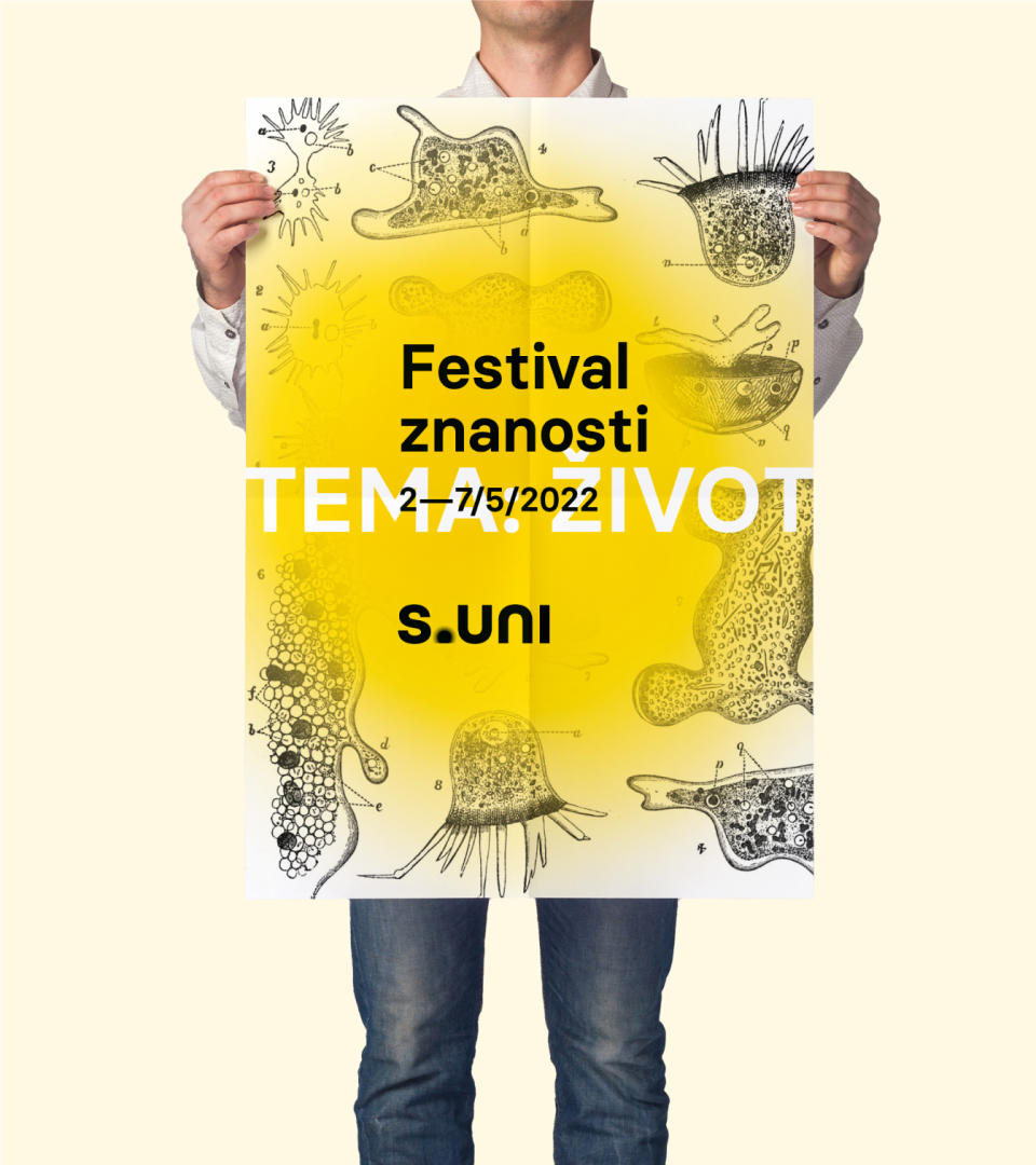
On a public tender for the new visual identity of the University of Split we proposed a concept that goes beyond the historical, cultural or geographical symbols in order to create as clear and strong a narrative as possible, at the same time universal and specific, and start building a unique educational brand.
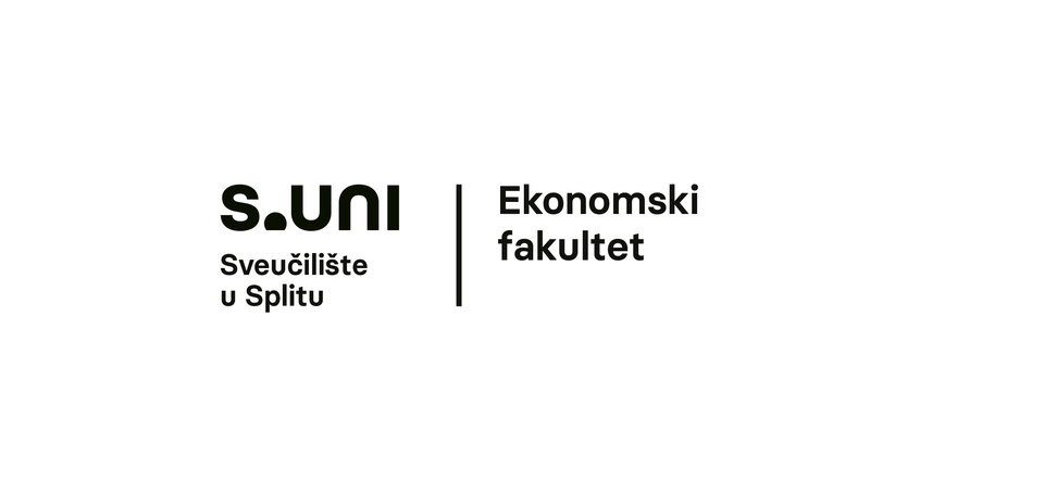
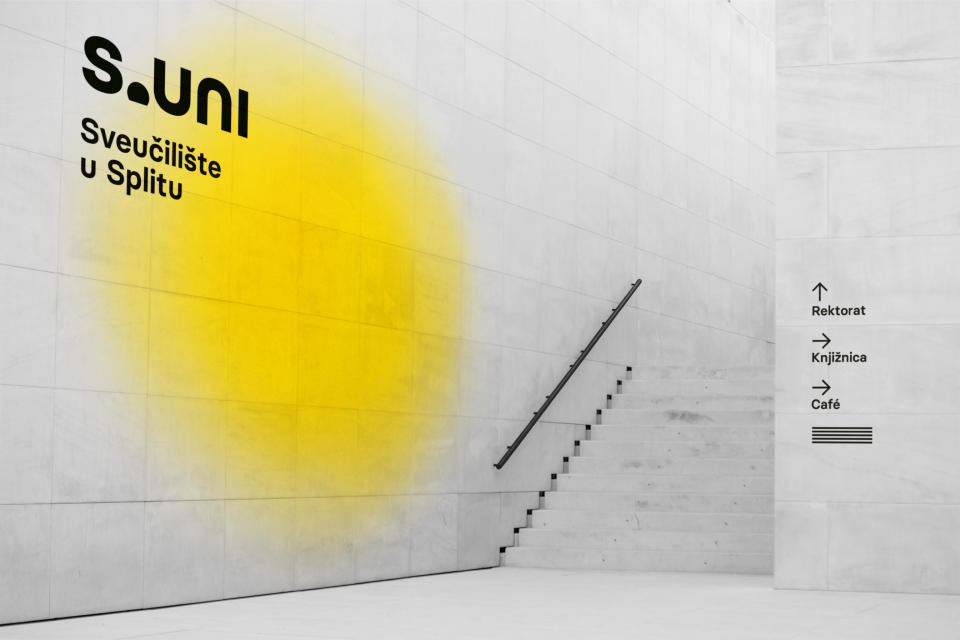
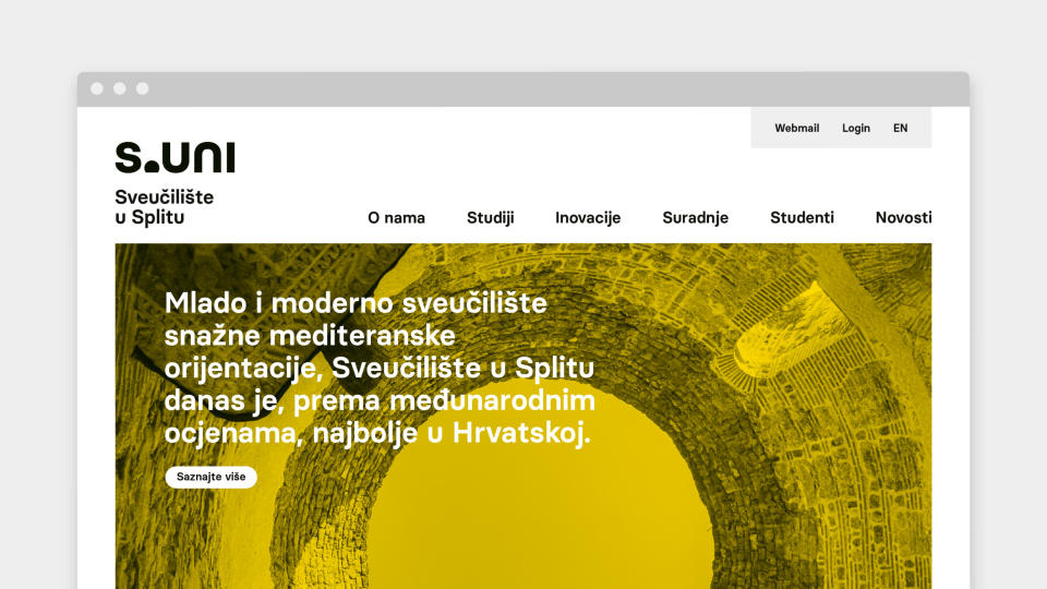
Main symbols of the concept are the sun as the symbol of the Mediterranean and light as the symbol of cognition and future full of potential. Both of them are great communicators of a progressive and fresh university that students easily identify with, equally appropriate for a wider public to remember. A shortened S.UNI (Split University) points to and complements the concept empowering it verbally. A small inversion of the bureaucratic UNIST gives it an evocative name and solves the problems in verbal and written language.
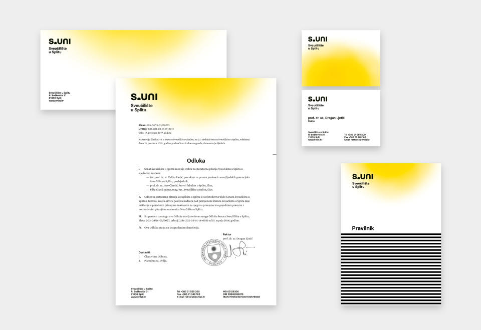
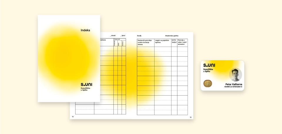
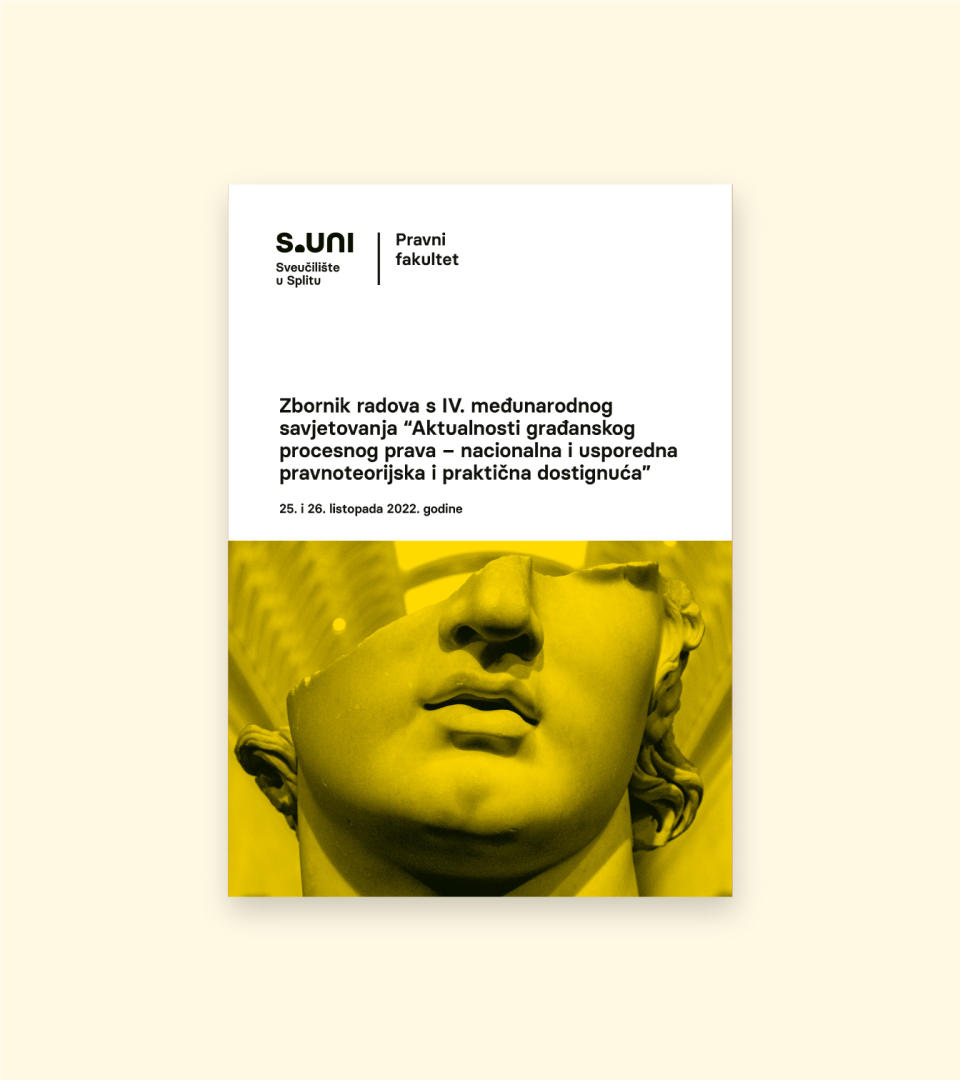
The visual system consists of a set of elements and modulates depending on the context of the usage. The official, ceremonial and promotional applications are aligned with their audience and message.

Second award at competition
- Art direction
- Visual identity
- Graphic design
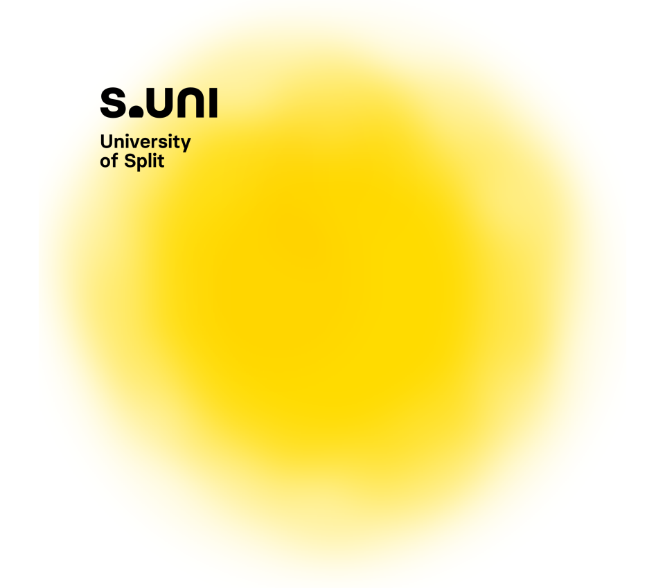
The illustration of the sun is the main secondary element of the system. With its recognisability, presence and warmth it ensures an emotional connection with the observer but also serves as a visual anchor for compositions with other elements. Inside the format it can move vertically, from sunrise to zenith.
Depending on the size of the logo, the number of rays in the sun is also customised. That way we ensure the legibility and the technical implementation in all media and sizes while in large format applications, primarily promotional, the logo gains richness and texture.
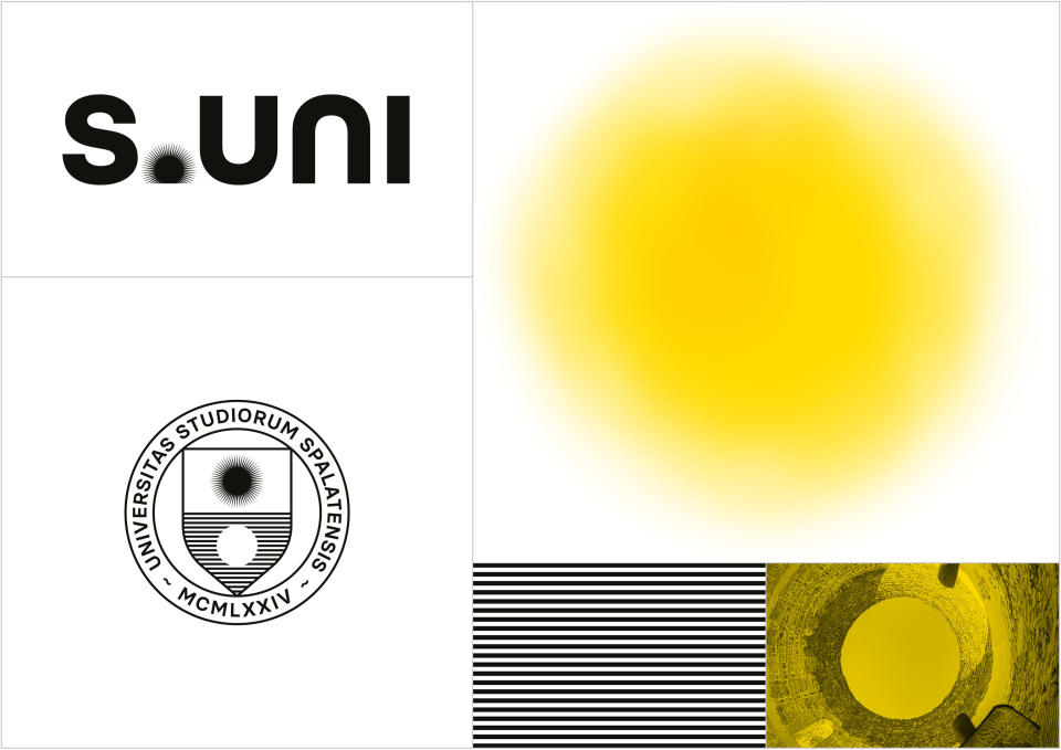
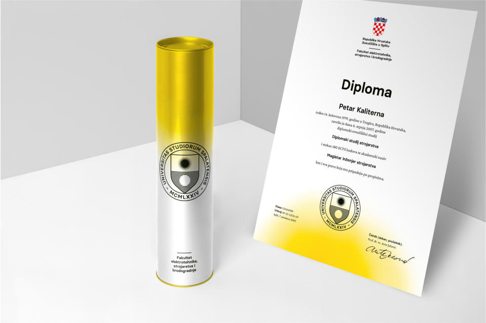
Ceremonial stamp is an extended and more ornamental expression od the basic concept. This is where we introduce elements of reflexion as a humanistic method and the horizon of the open sea as a symbol of open views as well as Split's architectural outlook.


Related projects
Lazareti
Visual identity
The Routes of the Frankopans
Integrated design

ZIC Split
Visual identity and communications